



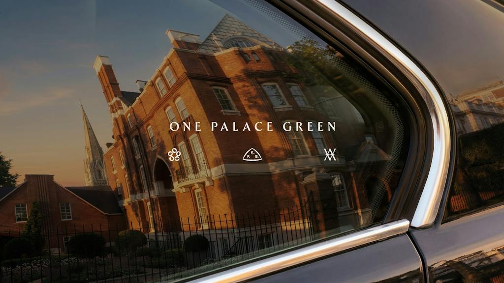

Appointed by developer REDD Real Estate, Greenspace was tasked with building an identity for the Grade II-listed building located on one of London’s private avenues. Designed by Arts and Crafts architect Philip Webb and completed in 1870 in the Queen Anne Revival style, the property was built as the London residence of George Howard, 9th Earl of Carlisle.
Its interiors featured work by William Morris’s firm, Morris, Marshall, Faulkner & Co, elements of which have been restored as part of the residential scheme. The architectural transformation is led by Pilbrow & Partners, with interior design by Martin Kemp Design and landscape design by Randle Siddeley.

The redevelopment converts the historic structure into five luxury apartments and a single detached coach house. Rather than positioning the project through standard residential marketing terms, Greenspace developed the overarching strategic identity ‘A Modern Masterpiece’, aiming to frame the property as a collectible item of architectural significance.
Adrian Caddy, founder and chief executive of Greenspace, said, ‘Thinking about this property purely through its real estate value fails to capture its true significance. One Palace Green is not part of a property portfolio; its cultural relevance is that of a heritage collection.’
Collector’s marks and typography
Greenspace drew directly from historical traditions of art provenance to structure the visual system. The concept centres on ‘Collector’s Marks’, referencing the monograms and stamps applied to artworks as they passed through different historic collections.

The primary logo for One Palace Green incorporates three bespoke marks. Each refers to a specific thread of the building’s lineage: the Howard family who commissioned the structure, the location on Kensington Palace Gardens, and the original creators Philip Webb and William Morris.
For the typographic system, Greenspace selected a customised version of Ergon by Commercial Type. The typeface was chosen for its calligraphic qualities, which mirror the letterforms common during the Arts and Crafts era while offering a contemporary structure for modern applications across print and digital media.
Colour palette and physical collateral
The colour palette uses deep greens, purples, and metallic finishes chosen to reference the immediate parkland context of Kensington Palace Gardens and the restored decorative features of the building’s interior.
To depict the property prior to completion, Greenspace commissioned artist Emily Robertson to create a series of watercolour illustrations. These depict the building’s exterior and its streetscape, reinforcing the craft-led focus of the underlying narrative.
The identity spans multiple touchpoints, with Greenspace delivering destination strategy, teaser film direction, digital and printed collateral, floorplan documents, and a dedicated website.
Become a Design Week member for £4/month or £40/year
Already a member? Sign in.






 Estudio EA