


Two Times Elliott shaped an editorial design system for ØTHERS, pairing Neue Haas Grotesk type with sculpted print by Imprimerie du Marais.
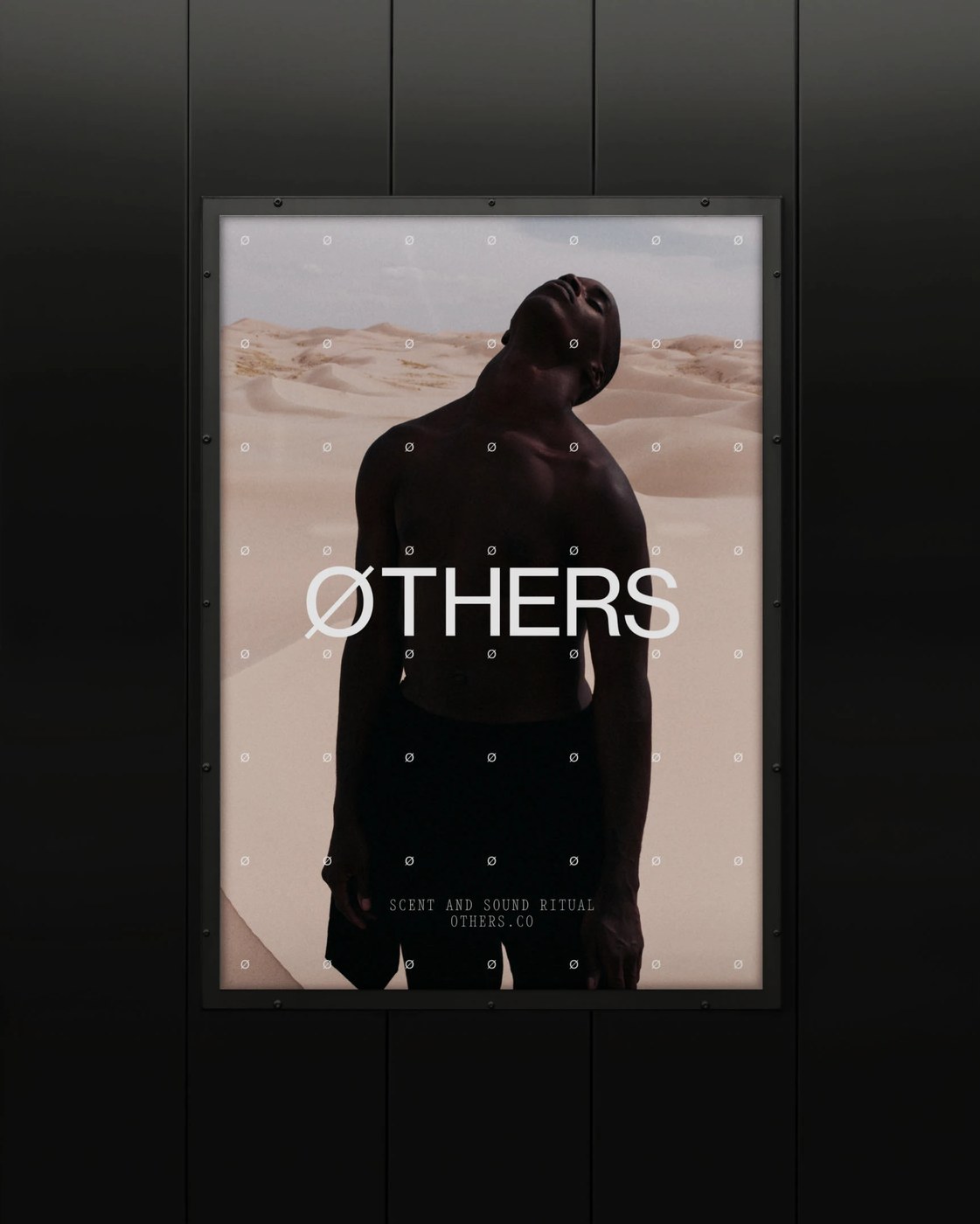
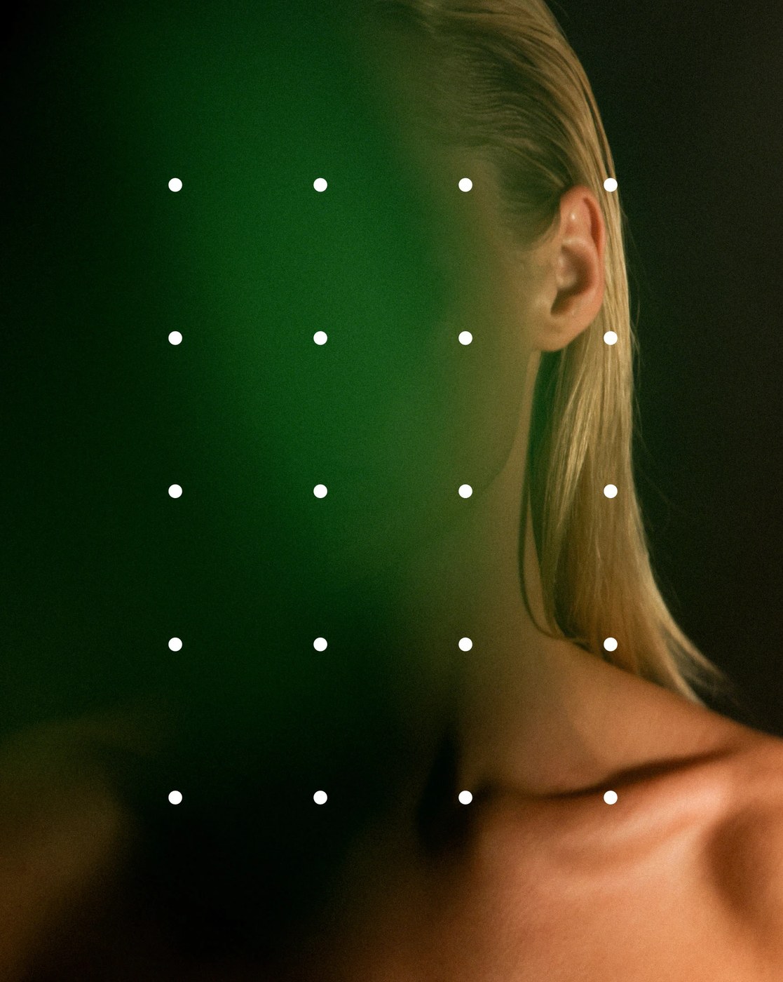
ØTHERS emerged as a counter-movement against mainstream wellness cliches, grounding mental tuning and sensory exposure rituals in holistic science and olfactory research conducted at White Mirror Lab in Lisbon. London design practice Two Times Elliott rejected pastel lifestyle tropes, constructing an austere visual language that treats self-discovery as a disciplined neurological practice. The identity hinges on a sliced “Ø” glyph—an activist mark signaling cognitive disruption and self-sorting. In large-format posters, this mark anchors sand dune portraits through a dot matrix coordinate grid, juxtaposing human vulnerability against stark technical framing. This tactile editorial design balances organic warmth with clinical distance.
Utilitarian Typography and Neurological Editorial Design
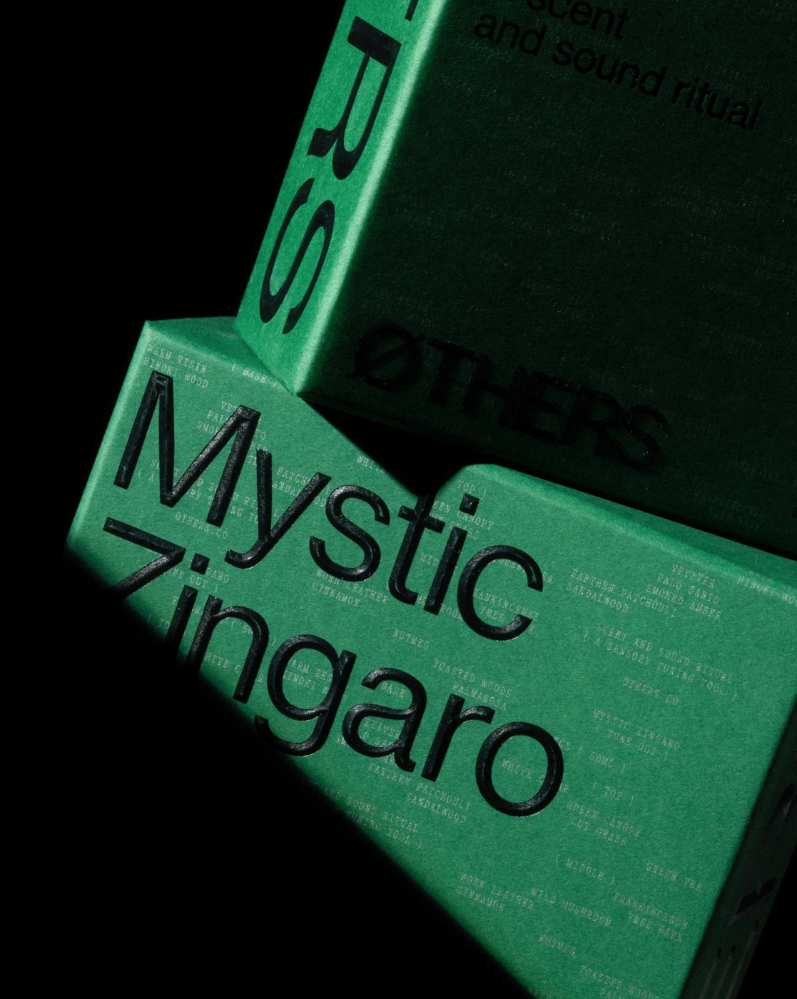
The reading architecture relies on a strict typographic dialogue between two contrasting typefaces. Two Times Elliott deployed Neue Haas Grotesk for primary titles and running metadata, lending direct authority to brand messaging. Running alongside, Art Company Mono introduces code-like annotations, bracketed formula labels, and technical ingredient breakdowns. The interior layouts enforce strict column margins, where delicate hairline dividers separate active wellness rituals from sensory telemetry. Micro-scale typography catalogs notes of hinoki wood, warm resin, and earthen patchouli across precise data tables. This rigorous editorial design ensures complex cognitive science translates into intuitive, readable hierarchies.
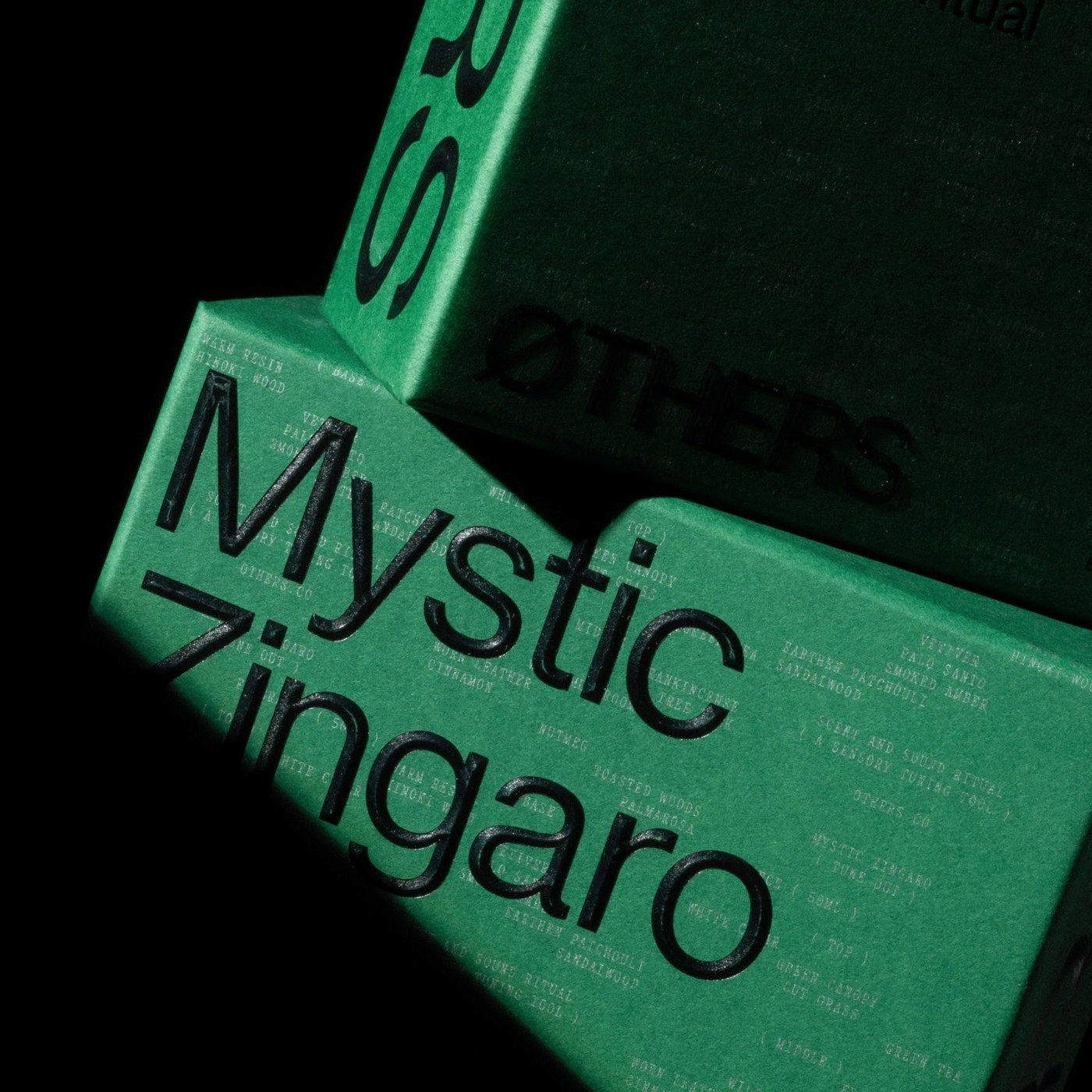
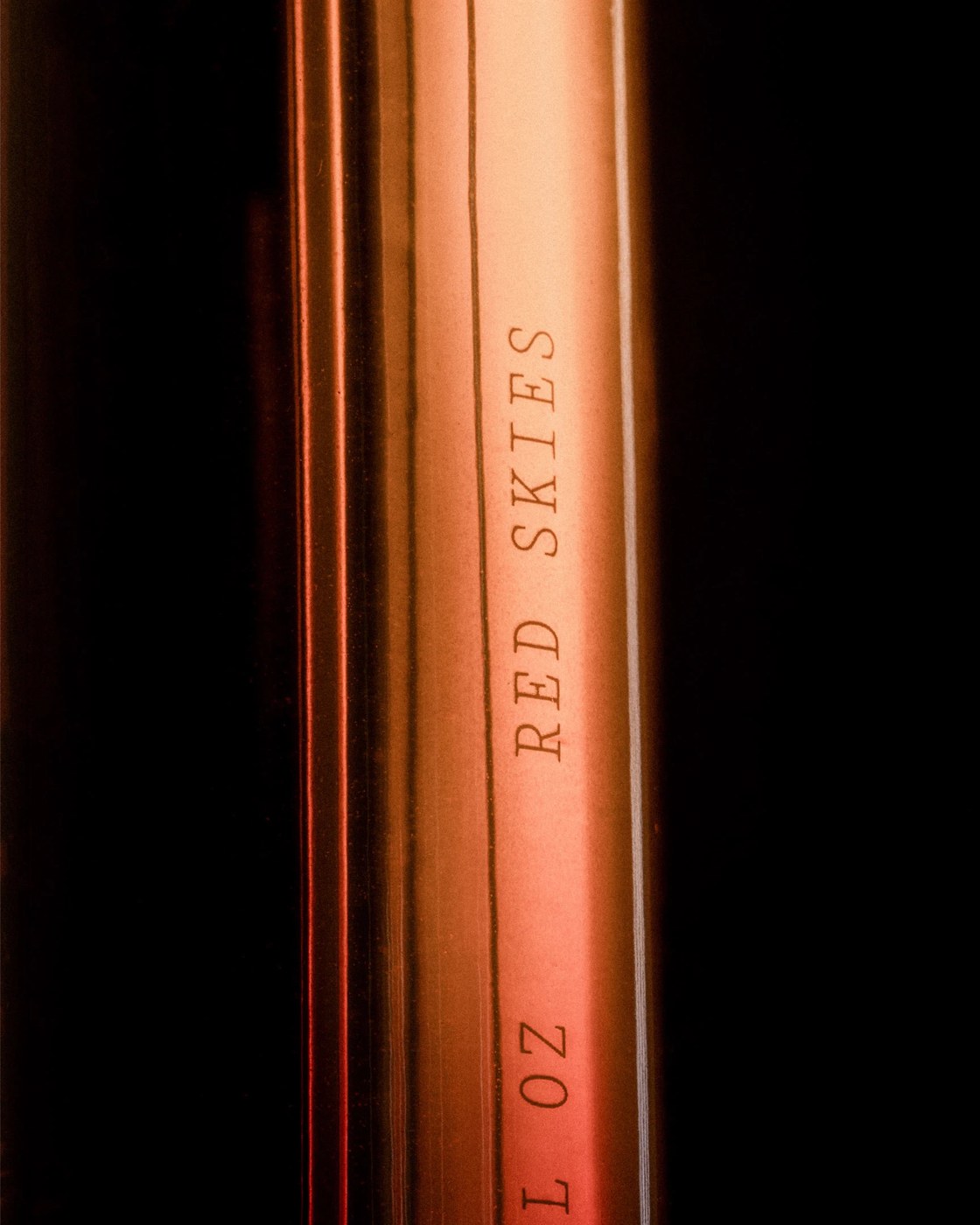
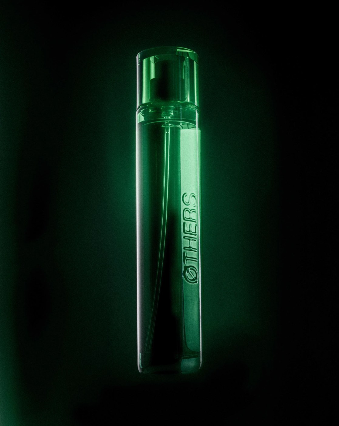
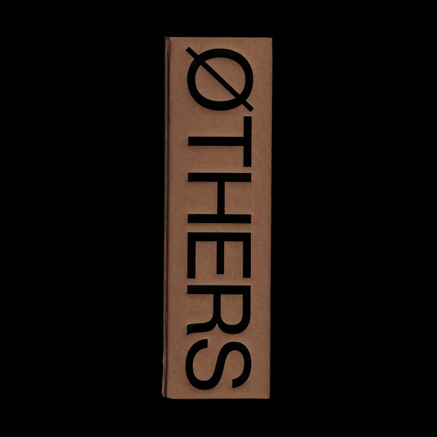
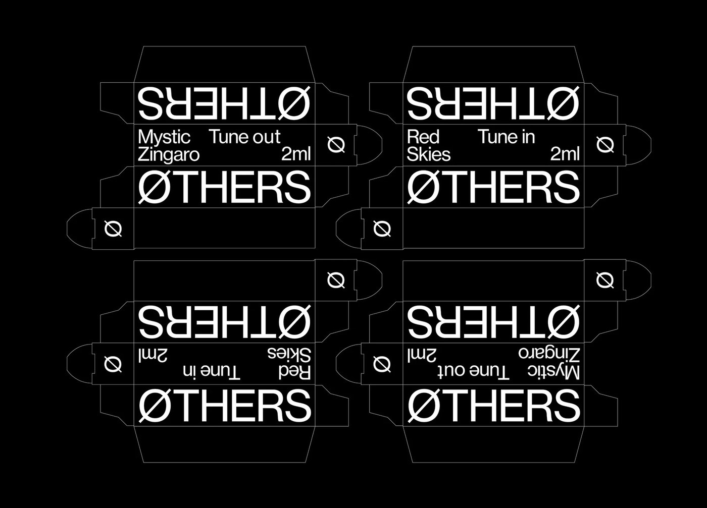
Physical materiality anchors the ritual in tangible artifacts. Developed in collaboration with master printers Imprimerie du Marais, the packaging suite features deep forest green paperboard stamped with a custom 3D sculpted emboss. High-build debossed letterforms spell out Mystic Zingaro and Red Skies across the outer shell, contrasted by silver Pantone text and blind-pressed structural grooves. These tactile paper boxes encase cylindrical glass vessels finished with two-tone gradient tints and engraved typography. Uncoated kraft paperboard sleeves and die-cut folding dielines complete the modular product suite. Through deliberate substrate choices, the editorial design proves that cognitive wellness tools gain authentic weight through uncompromising print craftsmanship.
See the full editorial design project by Two Times Elliott on Behance.

 Estudio EA