


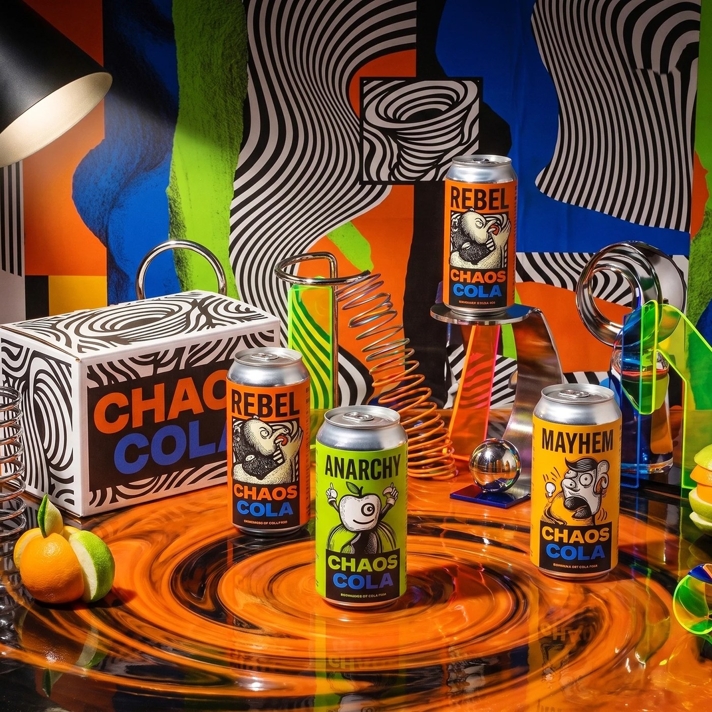

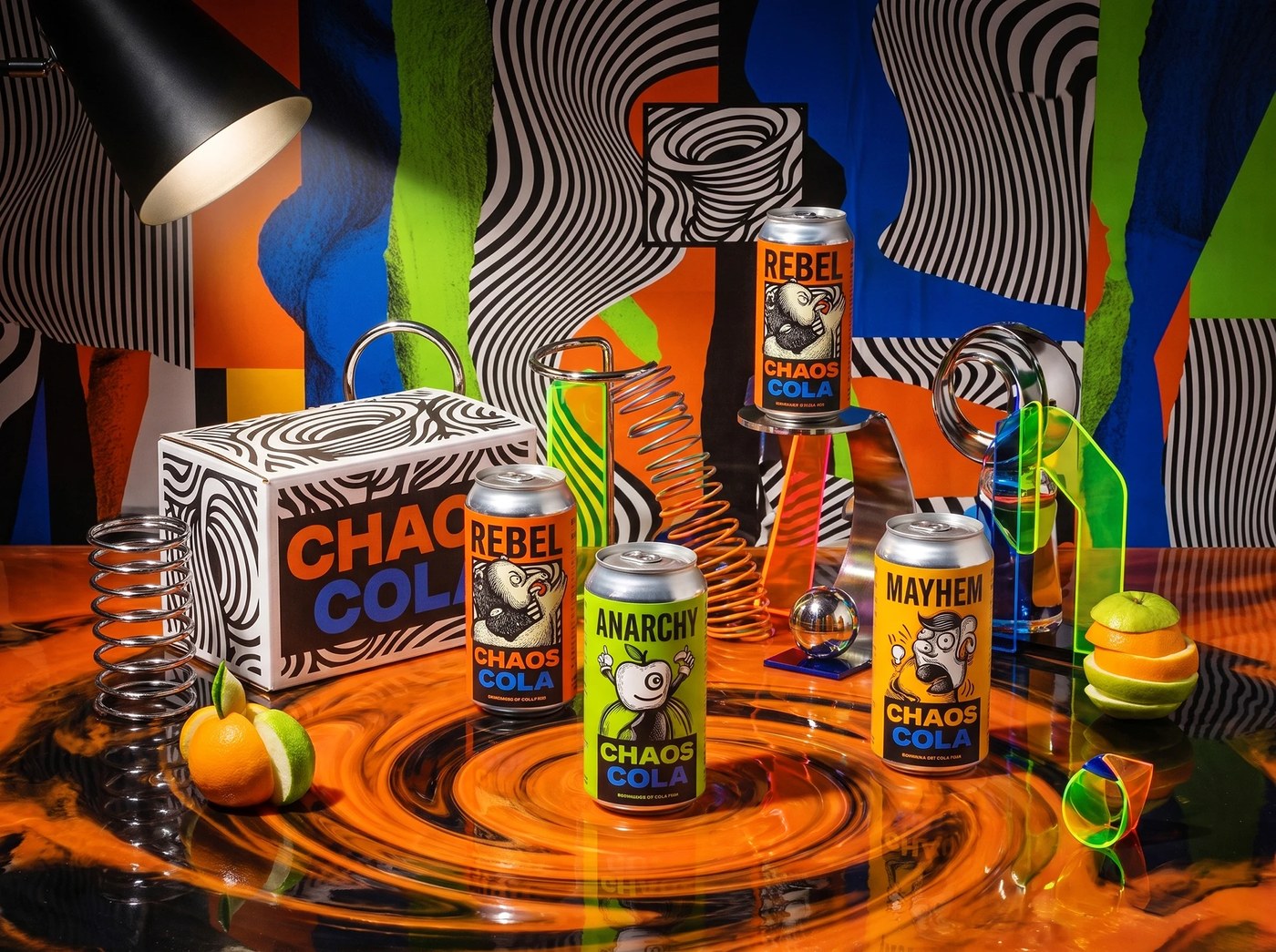
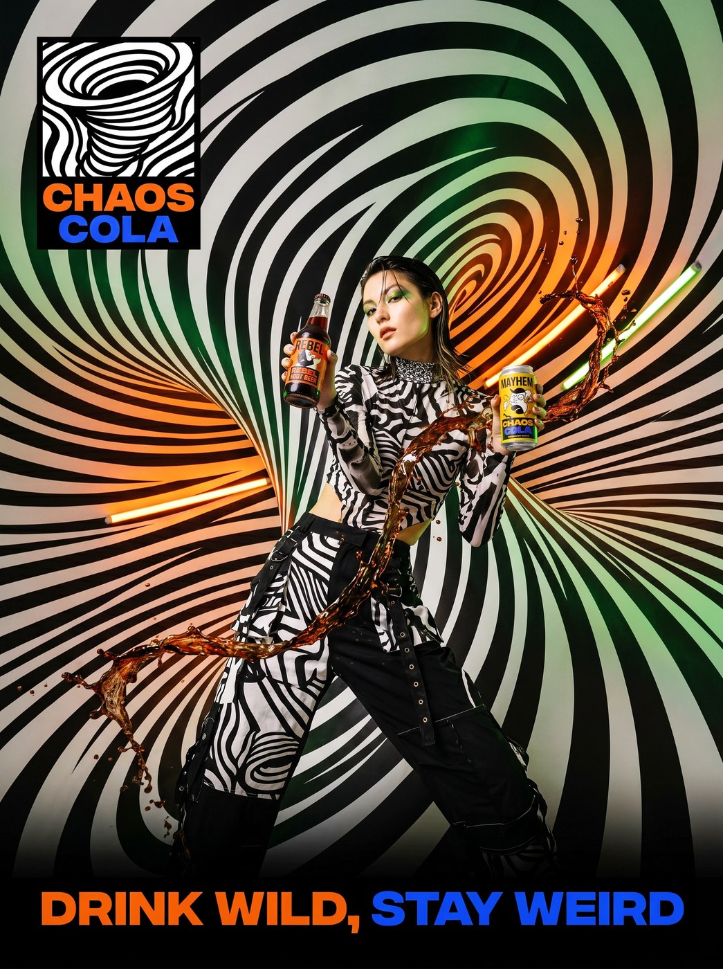
Explore the rebellious packaging design for Chaos Cola by Up-Brands, combining hypnotic Op-Art vortexes with underground comic aesthetics.
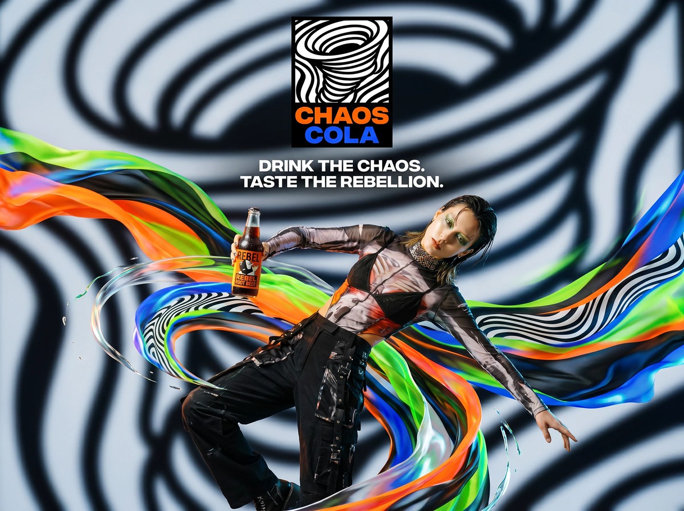
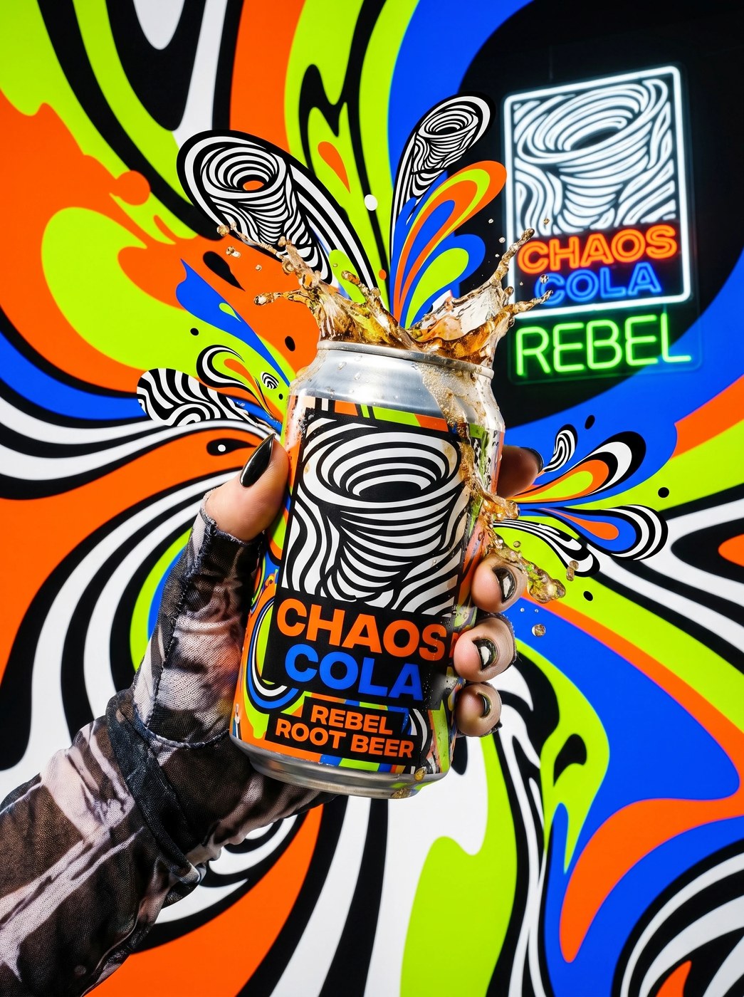
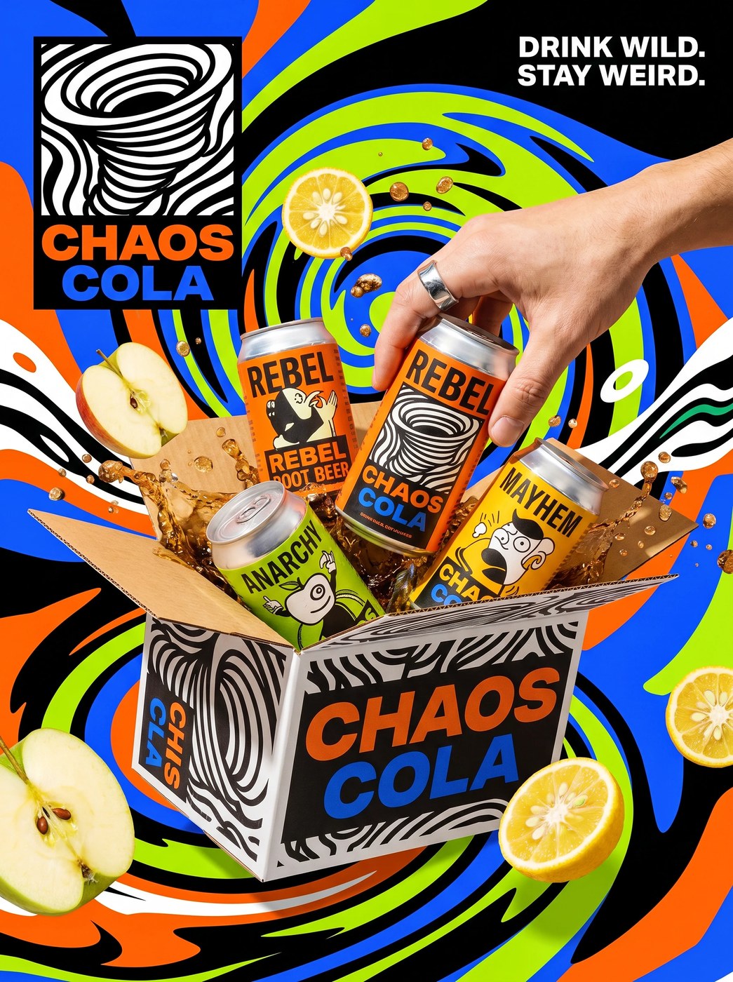
The fast-moving consumer beverage landscape often surrenders to sterile corporate uniformity and predictable pastel minimalism. Challenging this consensus, design studio Up-Brands formulated Chaos Cola around raw pop-anarchy and deliberate retinal disruption. The primary mark locks a dense, hand-drawn optical line-work tornado inside a rigid rectangular frame, anchored by heavy, condensed display typography. Rather than softening the visual impact for mass supermarket shelves, the packaging design treats the surface of each can and bottle as an aggressive canvas of street-level defiance, pairing dizzying optical waves with defiant underground comic mascots.
Op-Art Vortexes in Packaging Design
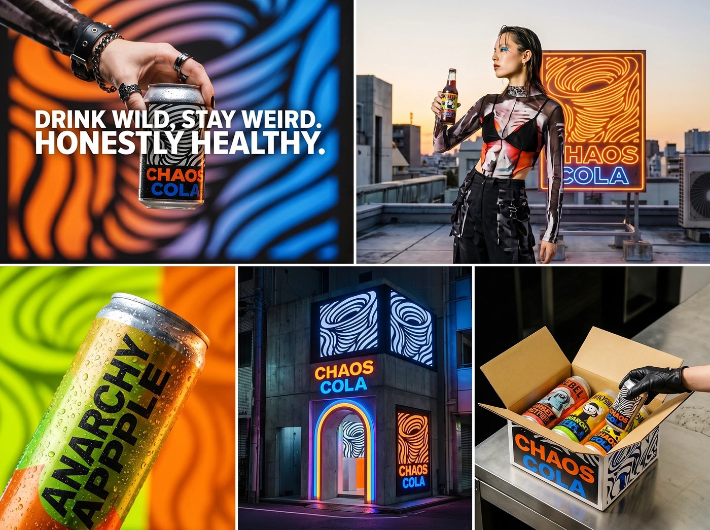
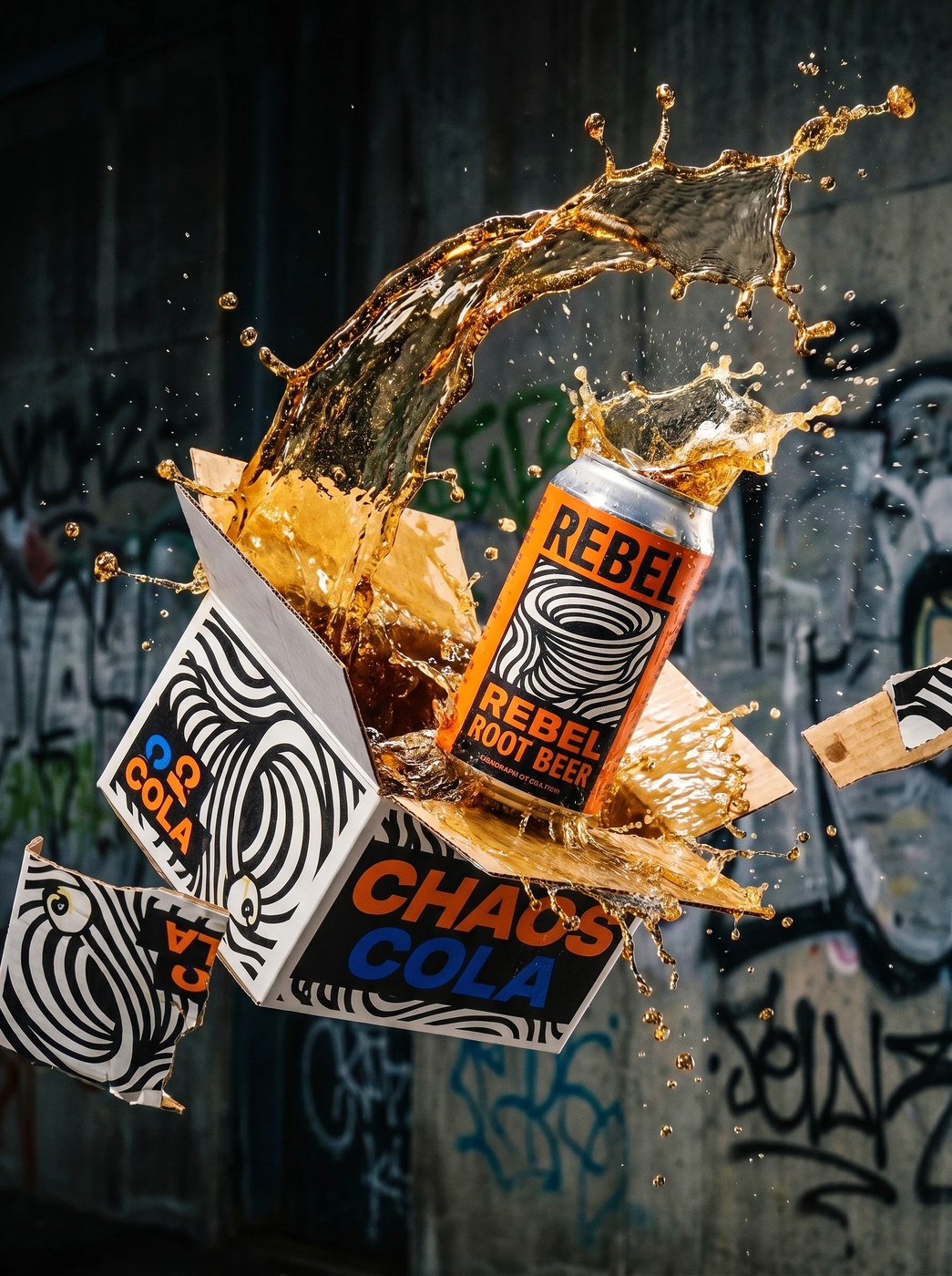
The visual architecture operates on extreme chromatic tension and tactile friction. Clashing hazard color blocks—Chaos Alert Orange, Anarchy Electric Blue, and Rebel Acid Green—collide against full-bleed black-and-white optical patterns. The flavor drops carry provocative titles like Rebel Root Beer and Anarchy Apple, illustrated with mutated fruit caricatures that inject irreverent comic book pedigree into the product lineup. Beyond standard aluminum soda cans and crown-cap glass bottles, the packaging design extends into an unboxing experience dubbed the Air-Drop Supply crate. Heavyweight white corrugated cardboard cartons are bombed with distorted wavy typography, dense graffiti line work, and fluorescent hazard stamps, transforming a direct-to-consumer soft drink delivery into a tactical artifact of skate culture.
Material ecologies reinforce the project’s subversive tone across both retail touchpoints and digital platforms. The cans feature matte-coated industrial aluminum finishes that contrast with high-gloss spot varnishes on typography, while physical flagship environments pair distressed raw-poured concrete panels with glowing gas neon fixtures and street tagging. Production assets developed in Illustrator and Photoshop maintain microscopic line resolution across complex moiré patterns, ensuring crisp ink registration across metallic substrates and rough unbleached paper fibers. Through unapologetic graphic force, this packaging design proves that beverage branding can channel underground subcultures without sacrificing commercial production rigor.
See the full project by Up-Brands™ on Behance.




 Estudio EA