


A stone’s throw from the Design Week office on Hope Street stands the Liverpool Philharmonic – a cultural titan as fundamental to the city’s identity as its waterfront. Home to the UK’s oldest continuing professional symphony orchestra, an iconic venue, and an expansive learning programme, rebranding an institution with this much civic weight is a delicate business. Get it wrong, and you alienate generations of loyal concertgoers; play it too safe, and you risk turning a living cultural hub into a static museum piece.
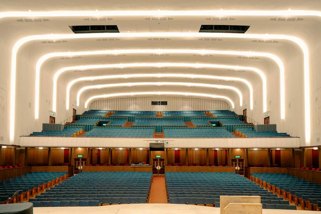
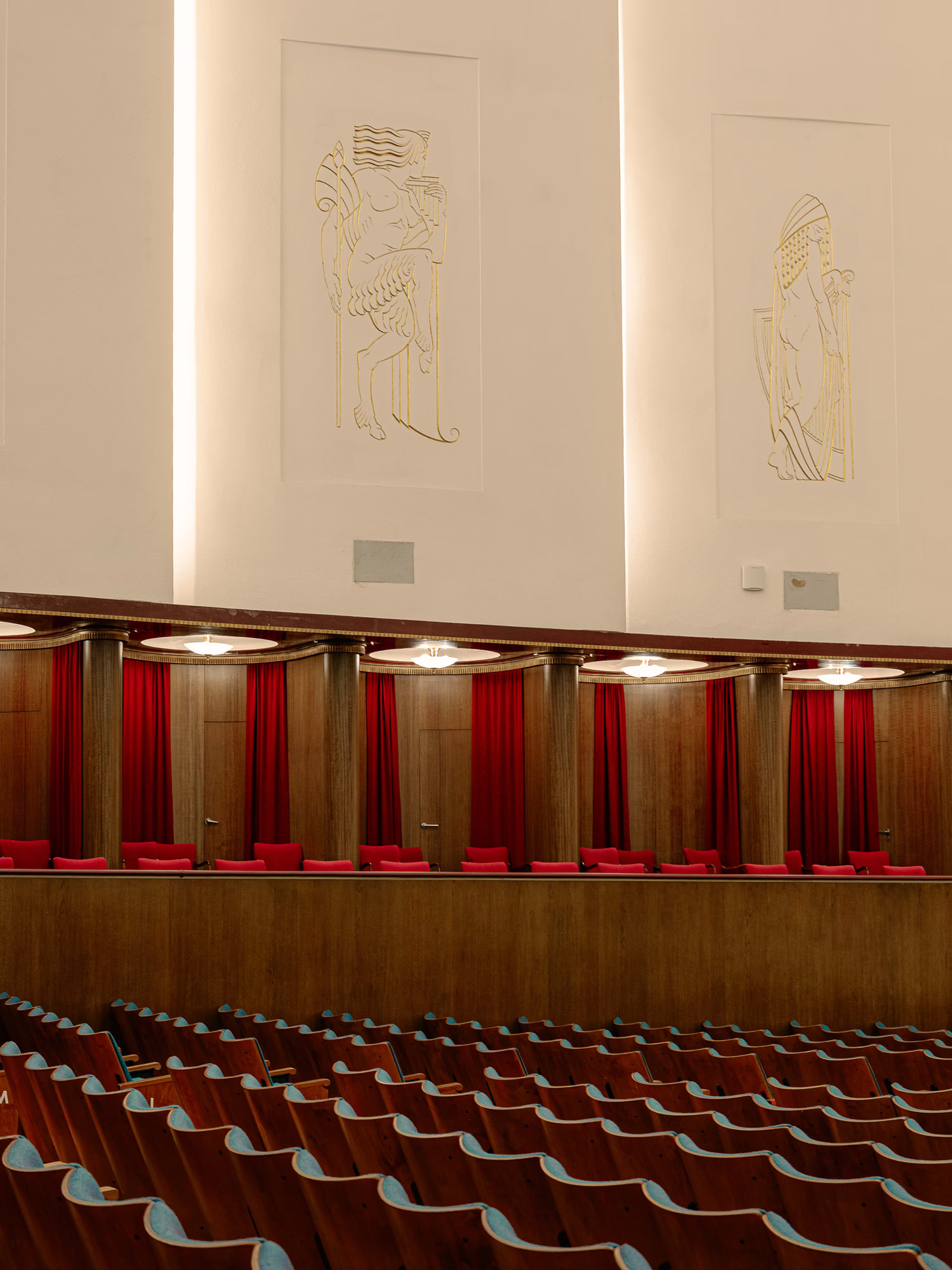
To navigate this challenge, Liverpool design studio Smiling Wolf has unveiled a sweeping new visual identity built around a digital-first design system. Rather than attempting to invent an abstract mark out of thin air, the agency drew directly from Herbert J. Rowse’s Grade II* listed 1939 Art Deco hall – specifically the auditorium’s cascading ceiling plasterwork and recessed light bays.
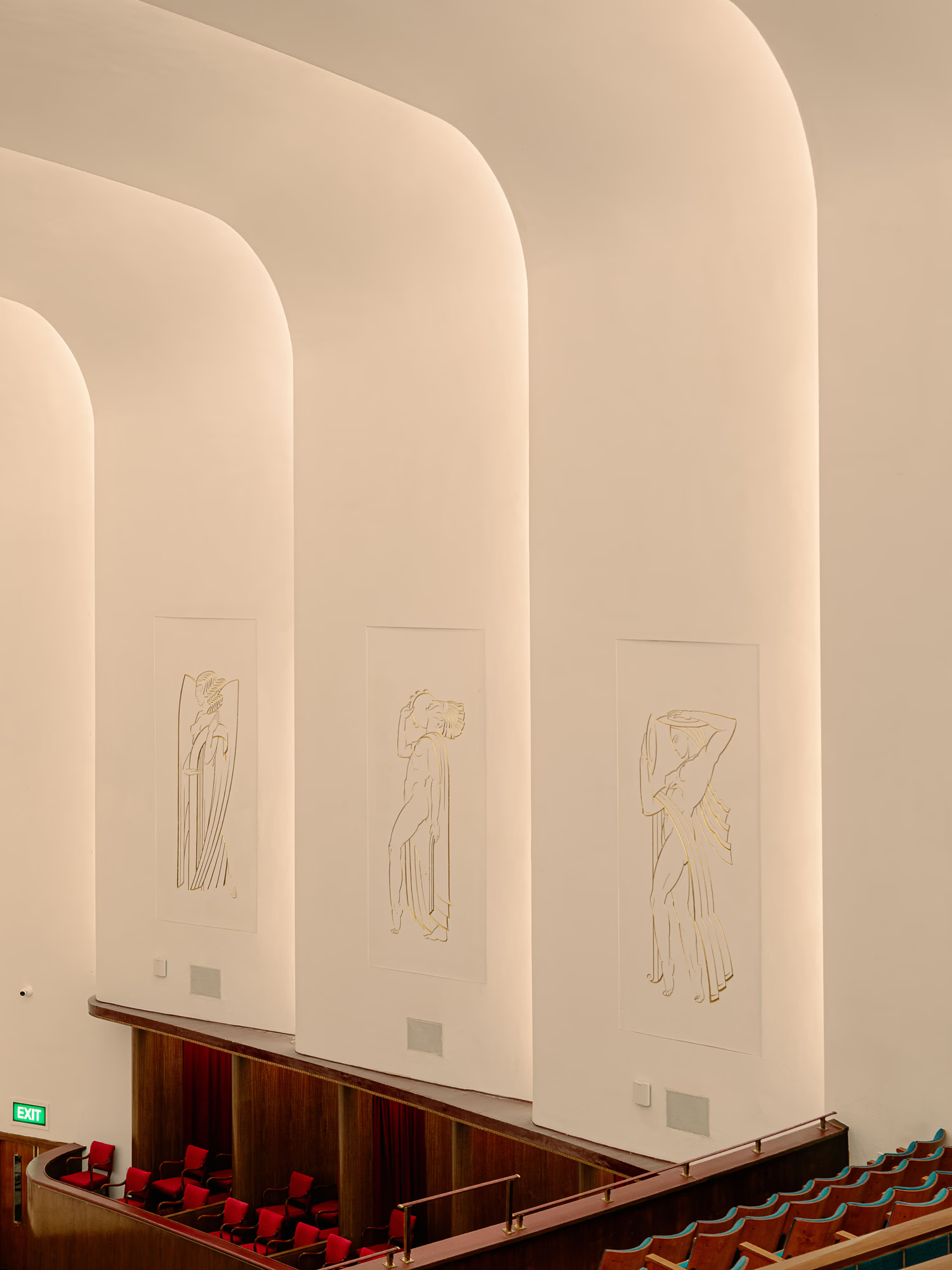
Respecting the shell, releasing the sound
“There’s a real responsibility that comes with designing for an institution with this much history and such a strong place in the city,” says Simon Rhodes, Founder and Managing Director of Smiling Wolf. “The challenge was giving it new energy without throwing the baby out with the bathwater – respecting its heritage and weight, while making it feel relevant and open.”
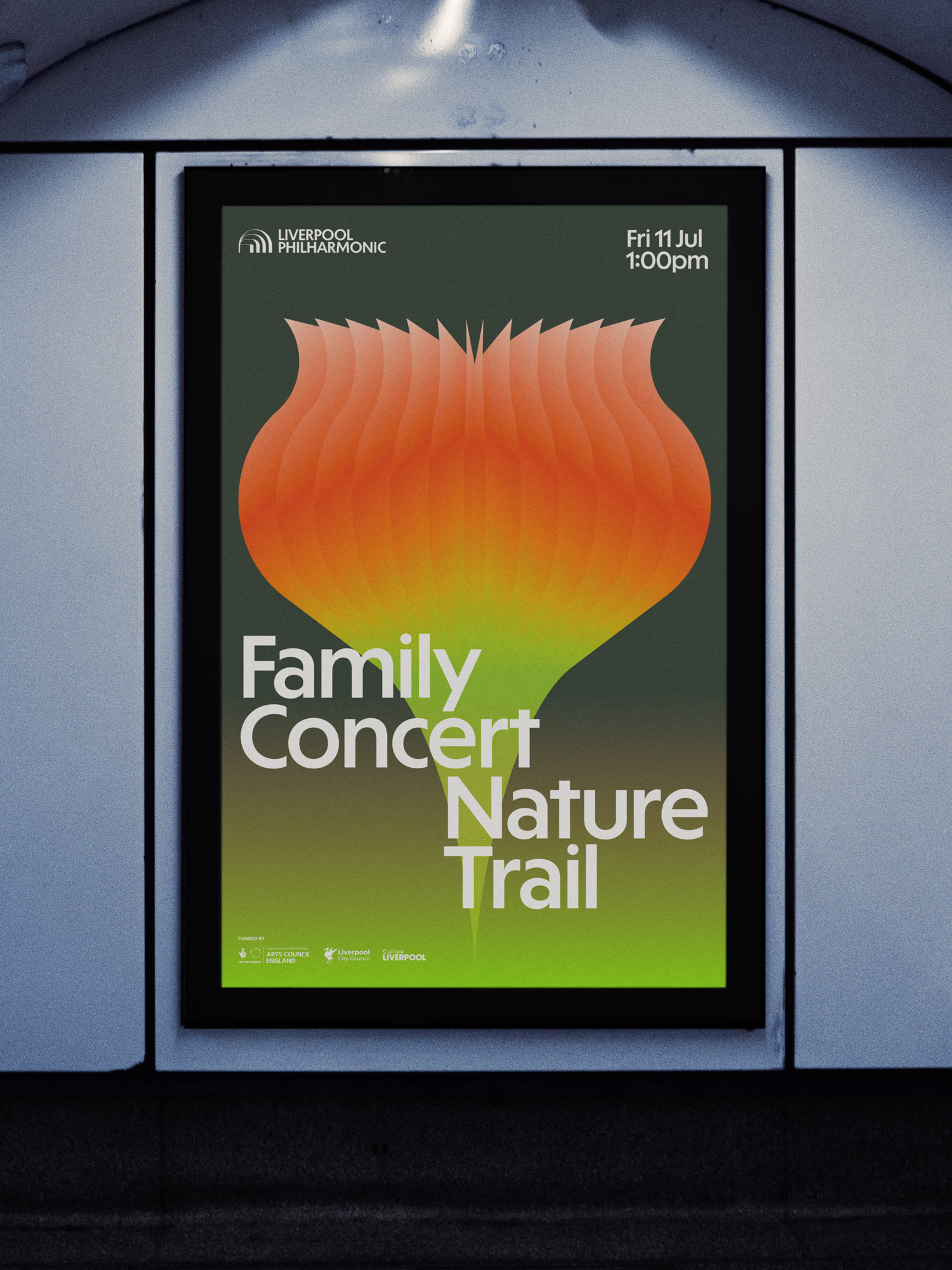
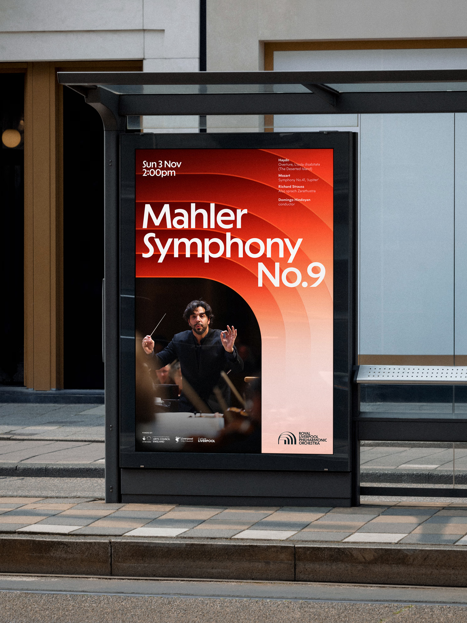
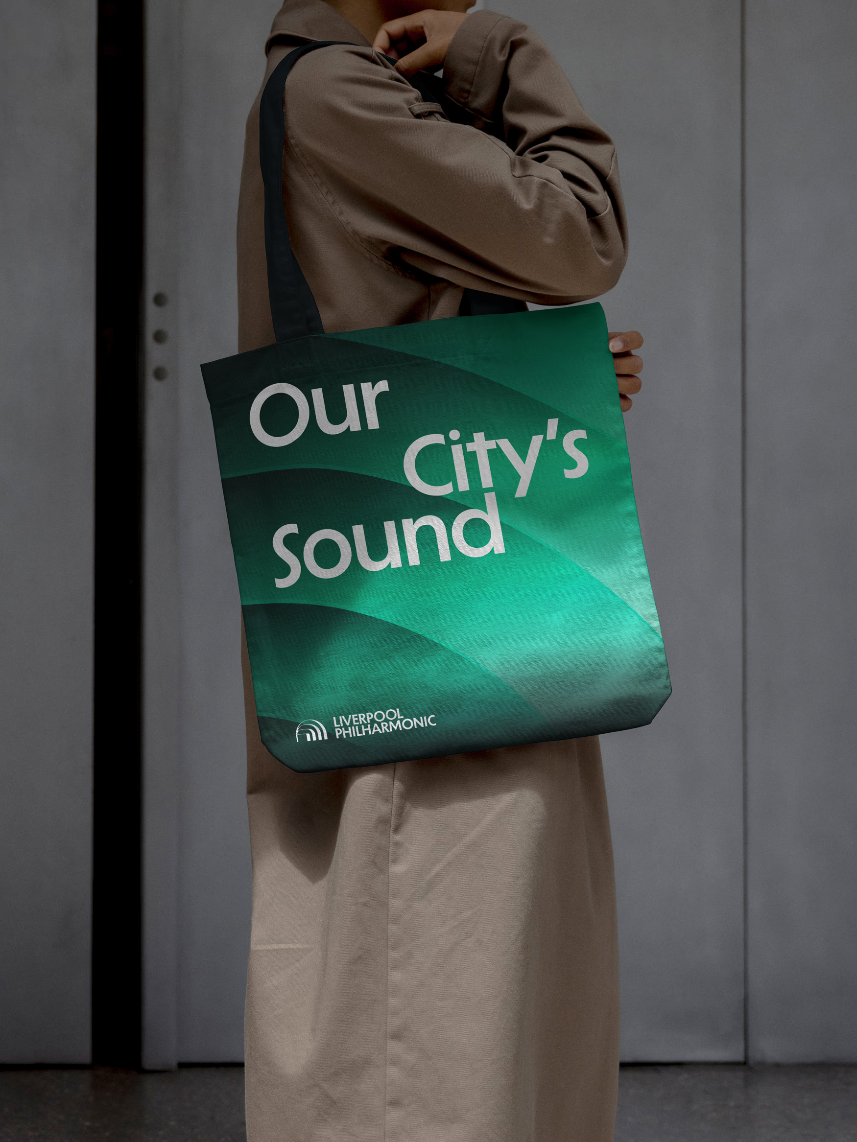
Budget figures remain discreetly undisclosed, but the ambition of the brief was expansive. The central visual principle, dubbed Afterglow, translates the hall’s distinctive architectural curves into a fluid graphic language. Concentric gradients, radiating bands, and soft geometric forms echo both the physical interior of the hall and the acoustic soundwaves rippling outward into the wider city.
You want your chest to swell a little when you show someone the Hall
“The Hall’s architecture gave us a distinctive starting point, but Liverpool Philharmonic is ultimately about people, not a building,” Rhodes explains. “That’s where the forms rippling outwards come in – an echo of soundwaves, but also of the Philharmonic reaching out into the city and its communities. And there’s a pride thing. You want your chest to swell a little when you show someone the Hall or take your Nan to a concert! It needed to retain that sense of stature and occasion.”
Myth, music, and memory
That sense of stature is something I know well. The Phil holds a particularly personal resonance for my family – my grandmother was a cellist, and my grandfather a conductor. Family lore always insisted they met in the orchestra pit beneath Rowse’s glowing ceiling arches.
I was always sceptical of this mythology. I was repeatedly told my grandfather, Frederick Trott, possessed a fine ear for music, but an even keener appetite for gambling, late nights, and erratic parenting. When the war ended, he departed for post-war Germany as an Allied commissioner assisting with reconstruction – a post where his penchant for bad decisions eventually caught up with him and brought about his untimely demise, leaving my grandmother back home to discover the family coffers had been emptied to the last pfennig.
Yet a recent foray into the digitised pages of the local press proved my grandmother wasn’t pulling my leg after all. There in black and white were the concert reviews from the 1940s! He really did play under the very same Art Deco ceiling arches that inspired Smiling Wolf’s work on the new identity.
A collaborative symphony
The visual refresh rests on strategic groundwork laid during an extensive “hearts-and-minds” discovery phase led by agency Fly a Kite, which engaged staff, trustees, stakeholders, and audiences to clarify the organisation’s vision and values. This strategic foundation was championed under the leadership of CEO Vanessa Reed and Director of Audiences Charlie Rachwal (with Sarah Ogle steering audience operations during Rachwal’s maternity leave).
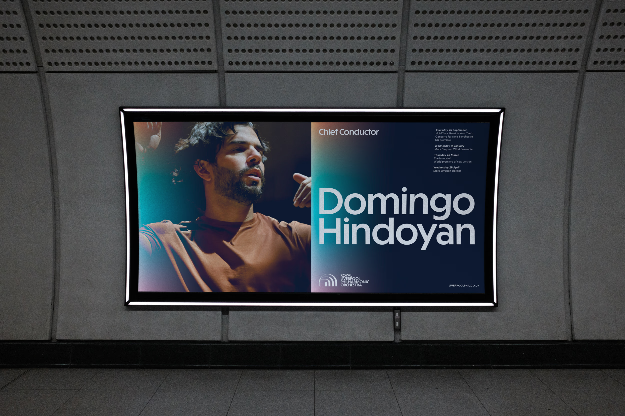
Rather than delivering a rigid static logo, Smiling Wolf crafted a practical, digital-first toolkit built around modular graphic amplifications named after the hall’s structural motifs: Arc, Glow, Wave, and Beam.
“Smiling Wolf built directly on Fly a Kite’s audience insight and translated it into a practical, digital-first toolkit rather than a single logo,” says Sarah Ogle. “Creative and rooted in place, they created a visual language that works as well on a phone screen or Instagram feed as it does on a poster.”
The broader brand rollout brings together several specialist collaborators:
- Fly a Kite: Strategic discovery, vision, mission, and brand storytelling.
- Smiling Wolf: Core visual identity, design system, motion templates, and ongoing photography and film direction.
- Supercool: Website design and digital development.
- One Further: Digital audience engagement and social media strategy.
Tuning into the future
Unifying an iconic venue, the UK’s oldest continuing professional symphony orchestra, and an extensive youth learning programme under a single visual umbrella is a formidable brief. Yet the new identity manages to balance prestige with accessibility. Warm, vibrant colour palettes flex seamlessly whether promoting an intimate acoustic session, an educational workshop, or a flagship performance under Chief Conductor Domingo Hindoyan.
While Smiling Wolf’s local presence wasn’t the sole reason they won the pitch, their intimate understanding of Liverpool’s cultural landscape undeniably infuses the work.
My rogue grandfather may have squandered his fortunes elsewhere, but the stage he once stood on remains one of the city’s finest monuments – now reframed in a visual language every bit as resonant, warm, and expansive as the music played within its walls.
Become a Design Week member for £4/month or £40/year
Already a member? Sign in.

 Estudio EA