



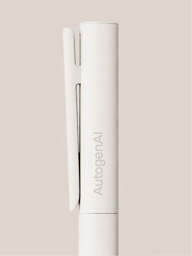

Brand consultancy Kiss Branding has developed a new visual identity and brand system for AutogenAI, an enterprise platform designed to help bid and proposal writers win more work. The rebrand coincides with a period of rapid global growth for the platform. Following a $39.5m Series B funding round co-led by Salesforce Ventures and Spark Capital, AutogenAI has expanded its operations into the US and Australia.
The business has grown its team into the hundreds and is now taking on global blue-chip organisations as well as US federal buyers. Kiss Branding was tasked with maturing the identity from an early-stage startup to a flexible system capable of building trust with new audiences handling highly sensitive information. The resulting identity spans marketing, product, and user interfaces.
Standing out from the AI crowd
A pivotal moment came when Kiss Branding presented the client with a single page filled with competitor logos, demonstrating the visual homogeneity of the artificial intelligence sector. To counter this, the consultancy drew inspiration from the clean aesthetics of white papers and academic publishing. The new identity revolves around a brand soul defined as ‘Master the Win’. This positioning emphasises that AutogenAI is a tool to empower bid writers, rather than replace them.
Consequently, Kiss Branding made a firm decision to completely rule out the use of AI-generated imagery within the brand. To shape the initial brief, the design team conducted interviews across AutogenAI’s product, security, sales, marketing, and leadership departments.
Because of the company’s scale, the brand now exists as live digital guidelines on Corebook rather than a static PDF document. Julie Scott, brand strategist at AutogenAI, said: ‘The precision in positioning AutogenAI through design is striking, and the ease with which marketing teams can implement it is impressive. The guidelines have helped us empower product designers to become custodians of the AutogenAI brand, rather than feeling siloed from it.’
The engine room
At the core of the identity system is the platform’s language engine, conceptually reimagined as a hexagon. This shape is designed to shift into a glass cube or a series of interconnected nodes. The glass forms signal transparency, while the cube reflects AutogenAI’s highly secure approach to data. Rather than scraping the open web, the platform runs exclusively on each client’s own proprietary knowledge.
Above and below the hood
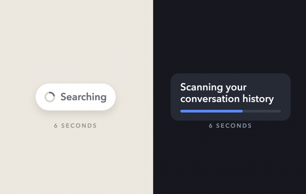
To cater to AutogenAI’s two distinct target audiences, Kiss Branding employed a car analogy, categorising buyers as either ‘above the hood’ or ‘below the hood’. The ‘above the hood’ approach targets executives focused on results, using rich colour, editorial layouts, and data graphics.
Conversely, the ‘below the hood’ identity speaks to technical teams seeking to understand the mechanics of the engine, using a stripped-back black-and-white colour palette alongside cleaner, more technical visuals. When targeting this technical buyer, the design system can easily deconstruct into the aforementioned nodes.
Matt Kilb, strategy director and co-founder of Kiss Branding, said: ‘The economic buyer wants sharpness and results, and the technical buyer wants transparency and clarity. We built one system that speaks to both.’
Finally, the wordmark has been sharpened into a more precise, architectural form, while a hexagonal ‘cut’ carries the engine’s core geometry across the typography, imagery, and layout.

Become a Design Week member for £4/month or £40/year
Already a member? Sign in.



 Estudio EA