


FORMA by Luciano Quintana presents a bold branding design study. The festival identity explores material culture and post-use object lifecycles.
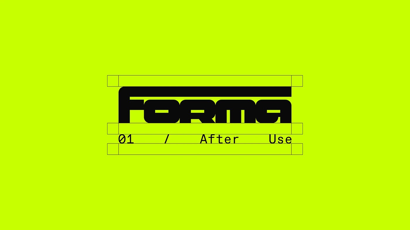
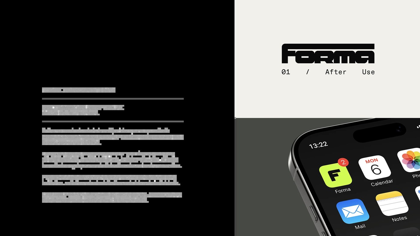
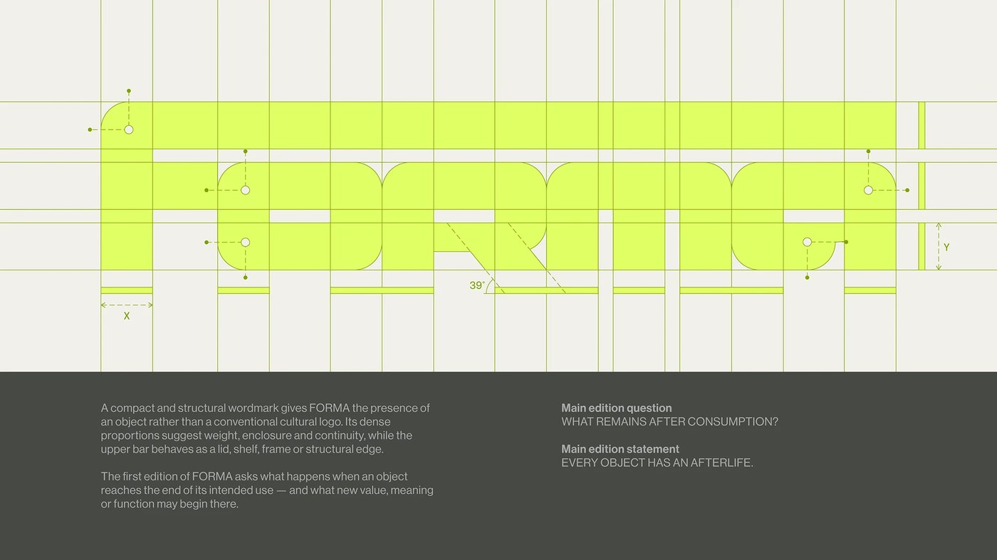
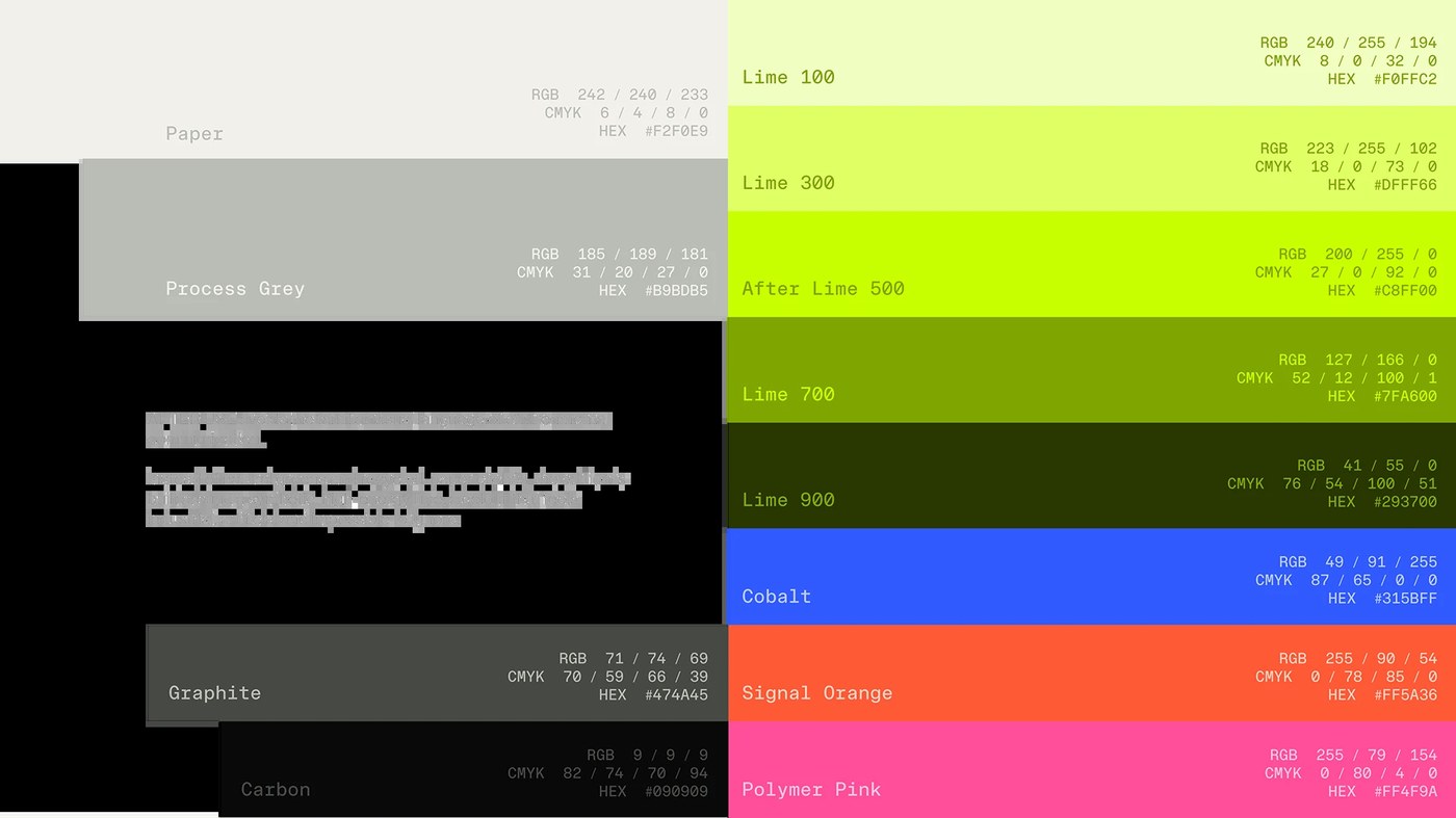
Luciano Quintana shaped FORMA around material culture and object life. The first edition asks what happens after use ends. Quintana built the branding design around physical presence and function. It does not rely on soft green tones or kraft paper. Instead, the identity uses high-energy lime with carbon black. Process grey and dark graphite balance the intense colors. The wordmark looks like a solid box or small tool. A flat top bar acts as a lid, frame, or shelf. This clean shape gives the logo real weight on every item. Four motion studies show the wordmark moving in digital spaces. Fluid kinetic clips extend the visual system onto event screens.
Branding Design System
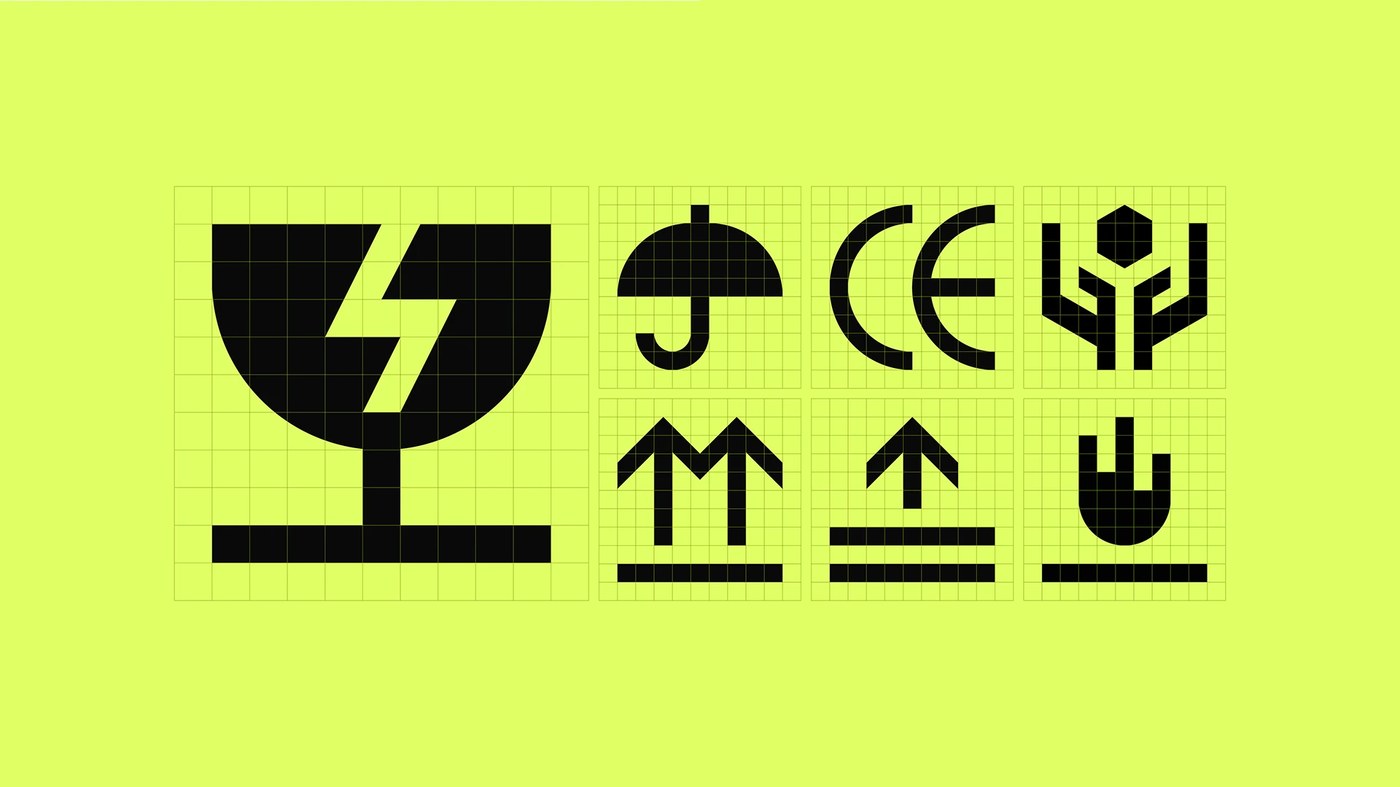
Dinamo supplied the primary typefaces for this branding design framework. Quintana chose ABC Favorit alongside ABC Favorit Mono. Large display titles rely on ABC Favorit for clear visual presence. The monospaced cut handles schedules, room numbers, and dates. Clean thirty-nine degree cuts match the modular grid layout. Technical bounding boxes give posters the feel of an architectural plan. Custom packaging icons add to this industrial grammar. The designer redrew classic crate marks into sharp vector glyphs. On mobile screens, the app icon keeps the same bold geometry.
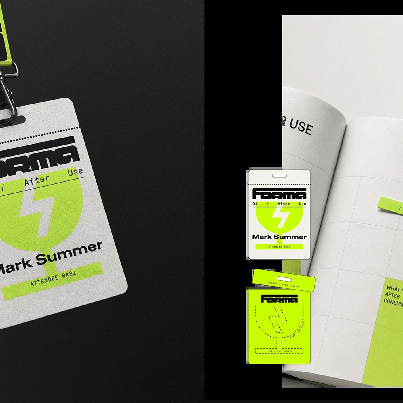
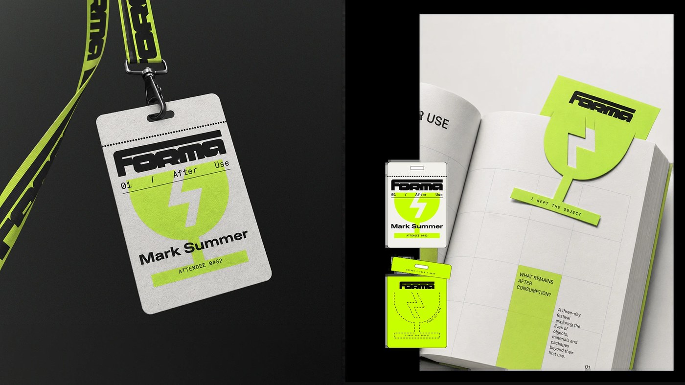
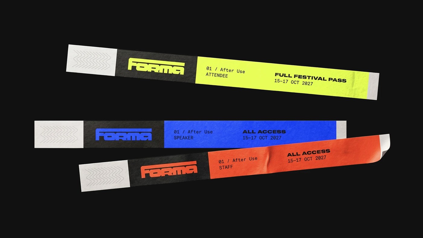
Physical print pieces bring the core concept to life. Quintana turns routine event badges into long-term tools. Uncoated grey badges hang from bright woven lime straps. Each pass holds a die-cut bookmark for the festival book. Users pop the mark out and keep it after the event. Smooth Tyvek wristbands mark access for guests, staff, and speakers. Blue, orange, and lime bands separate each room tier. The rigorous branding design makes every small object feel permanent and useful. Each printed piece proves that practical items can have an afterlife.
See the full project by Luciano Quintana on Behance.



 Estudio EA