


SAVVY STUDIO structured the Adam Pendleton monograph around 1960s computational punch cards and concrete poetry for rigorous editorial design.
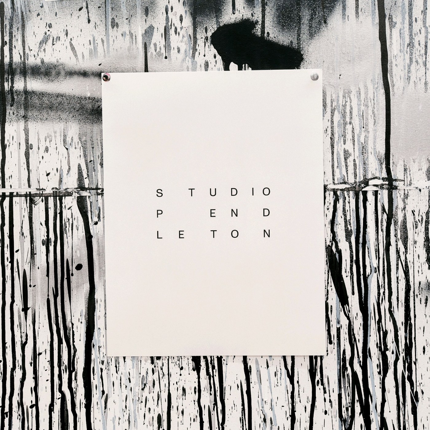
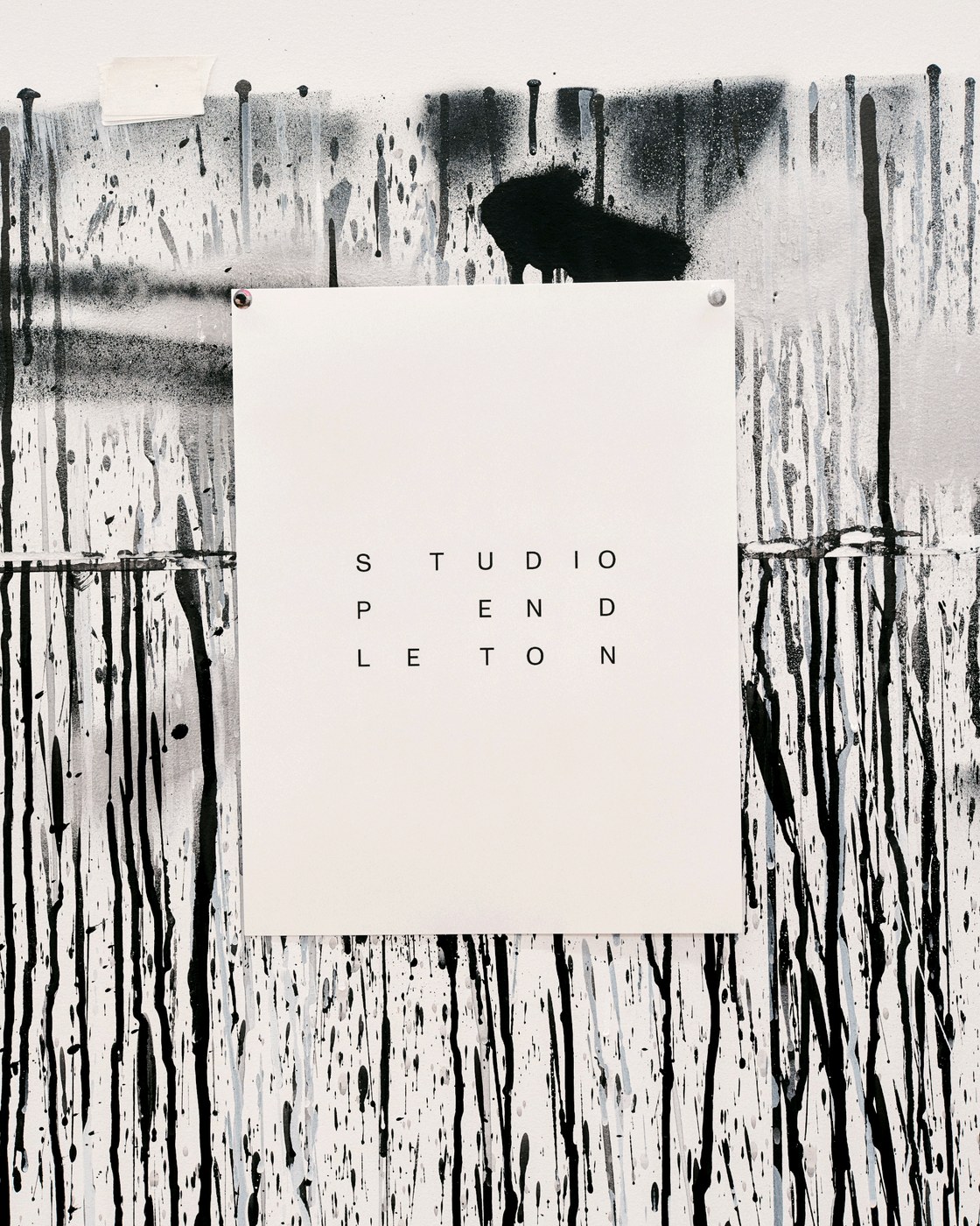
Adam Pendleton operates within a strict visual universe defined entirely by black and white. For his studio identity and print collateral, Mexican agency SAVVY STUDIO devised a framework that mirrors the conceptual tension within Pendleton’s artistic practice. His paintings investigate the residue of subjectivity through language, gesture, and fragmented history. Rather than imposing a standard gallery layout, the studio created a dynamic system where utilitarian order collides with poetic disruption. The stark chromatic palette strips away decorative distraction, forcing attention toward typographic placement, raw ink density, and the architectural weight of negative space.
Punch-Card Grids and Fluxus Systems in Editorial Design
The underlying layout architecture finds its foundation in Toshi Ichiyanagi’s 1960 musical composition, IBM for Merce Cunningham. Ichiyanagi scored his work using graphic notations inspired by 1960s IBM computer punch cards. SAVVY STUDIO translated these historical punch-card matrices into a functional grid for editorial design. Unlike rigid modernist column arrangements, the system organizes information around the center gutters of the page spread. This structural technique draws direct lineage from the concrete poetry of Fluxus figures like Georges Brecht. Text blocks align to rhythmic coordinates across the sheet, giving body copy and catalog data the syncopated cadence of sound art while preserving typographic clarity.
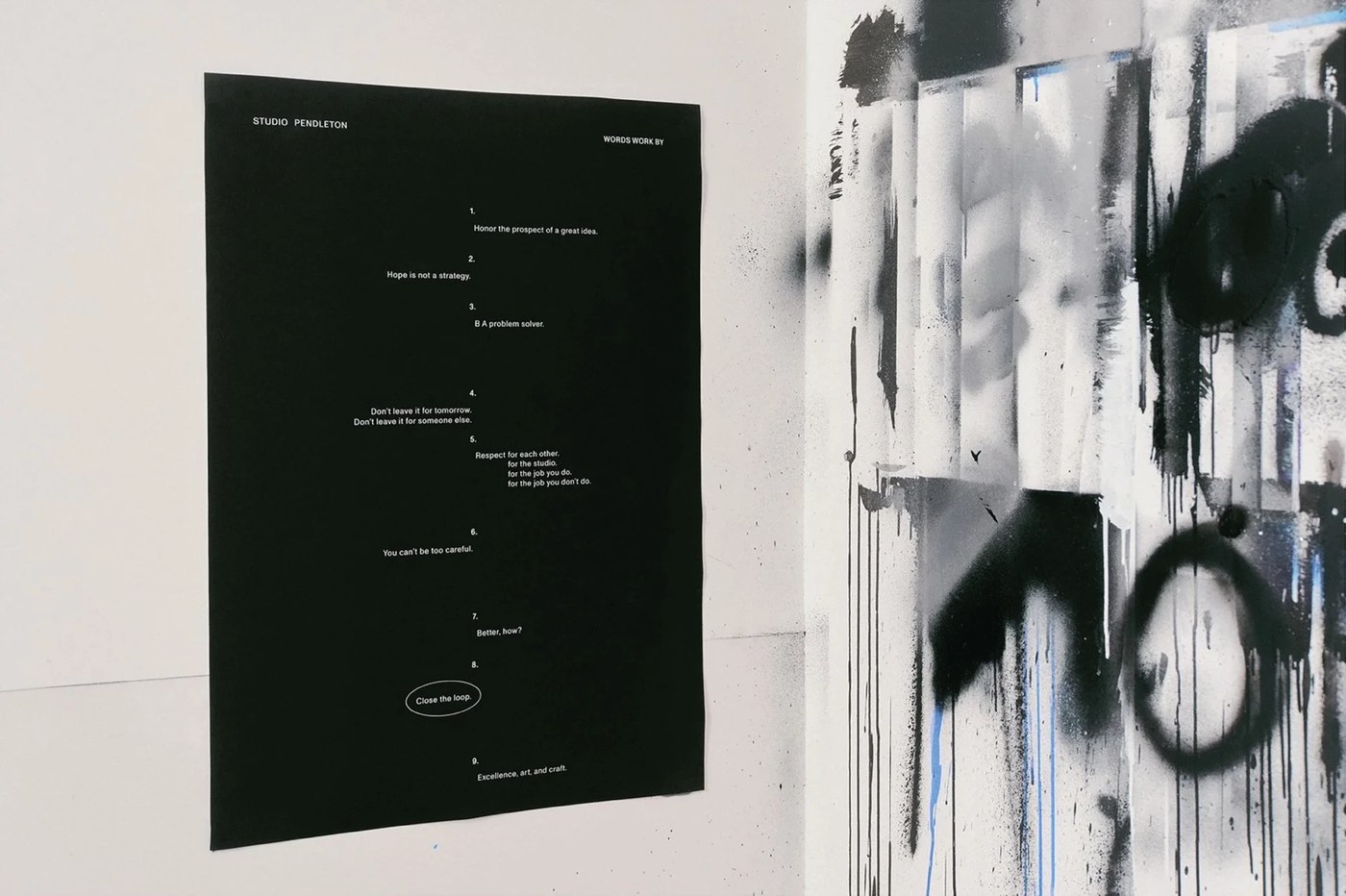
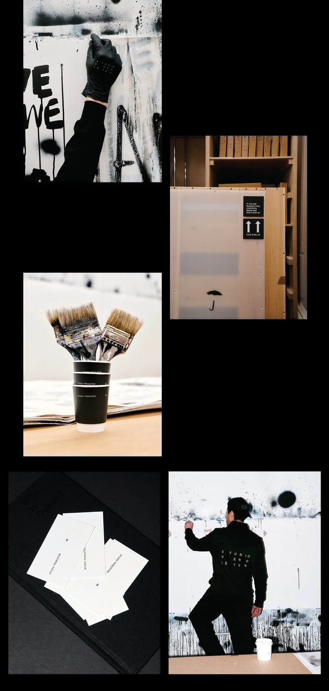
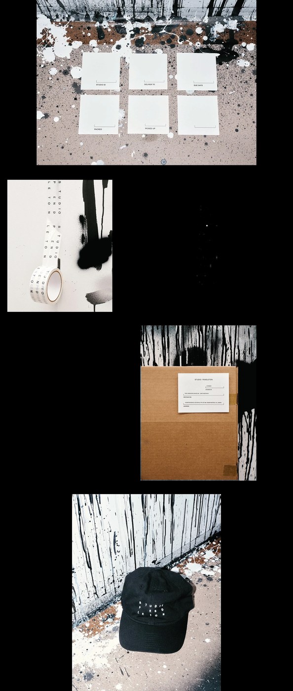
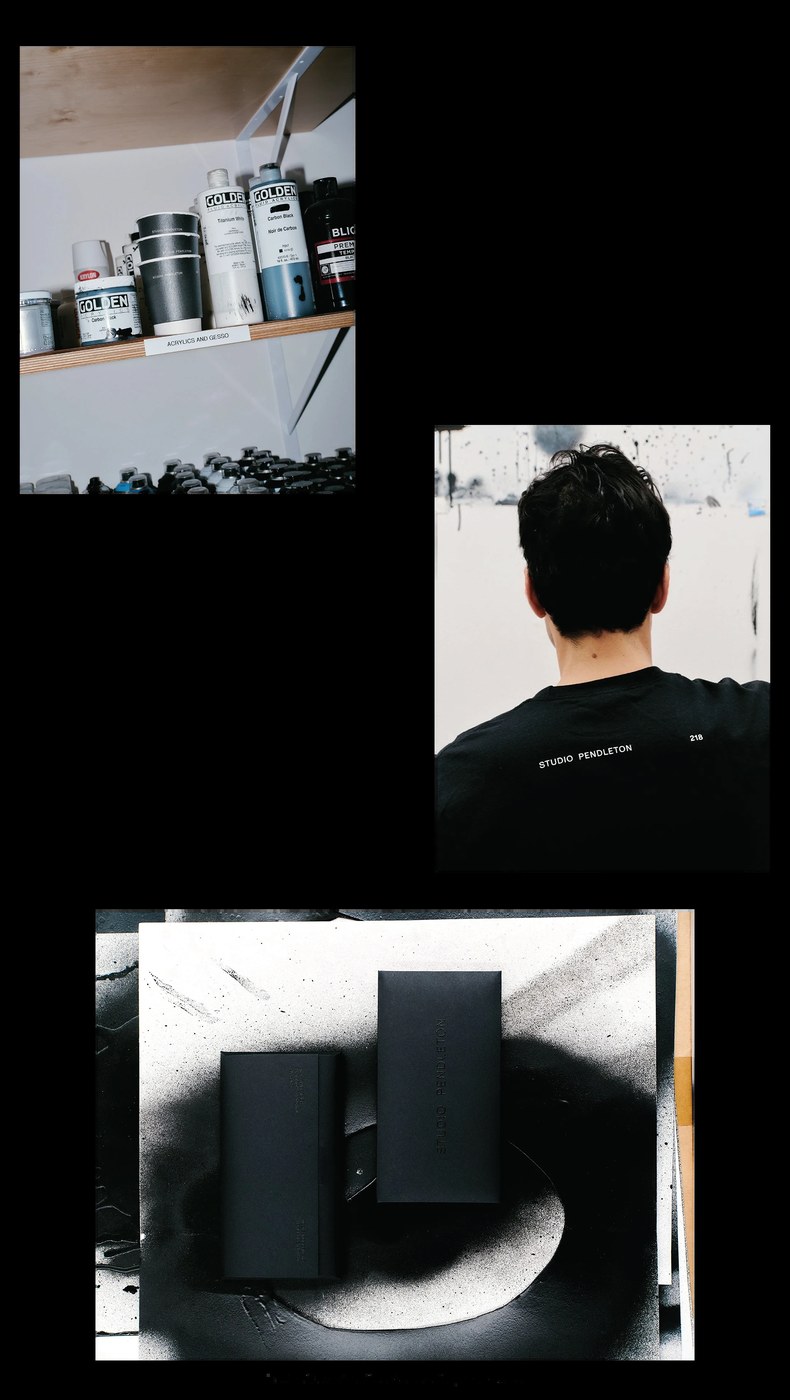
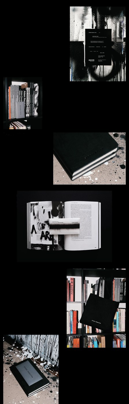
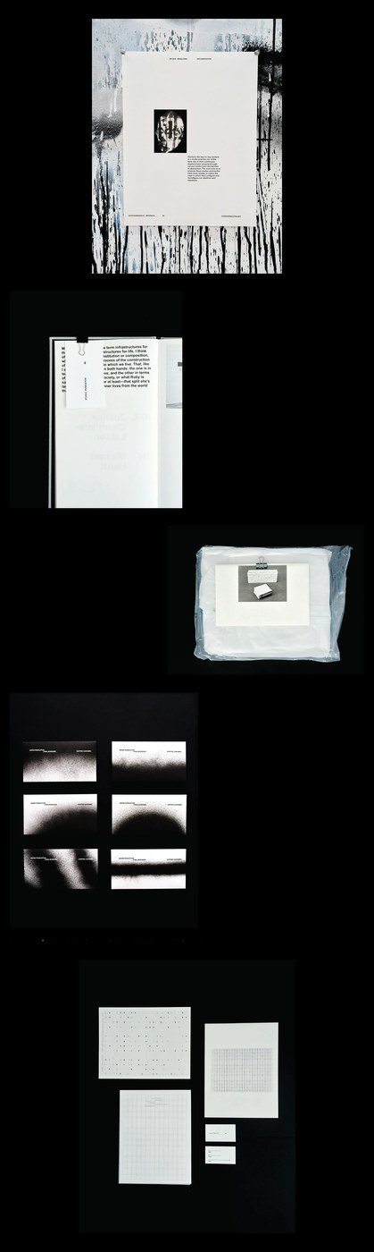
Physical collateral extends this conceptual grid into everyday studio materials, documented in high-contrast photographs by Clément Pascal. Bound monographs, exhibition invitations for the Hirshhorn Museum, and hardcover notebooks utilize tactile uncoated stocks paired with deep carbon-black silkscreen printing. The identity system migrates across shipping crates, stencil-marked adhesive tape, inventory labels, and studio workwear without losing typographic integrity. Gradient spray-paint dust from Pendleton’s working canvases interacts with pristine paper edges, creating an ongoing dialogue between raw fine-art production and precise print craftsmanship. The result demonstrates how archival research can revitalize contemporary editorial design.
See more from SAVVY STUDIO on Behance.


 Estudio EA